Honours Thesis - Distribution of Null Points in a Turbulent Magnetohydrodynamic Field
My Honours thesis in Mathematics at the University of Newcastle revolved around what are known as "null points", places in a vector field, in this case the magnetic and velocity fields of a turbulent magnetohydrodynamic field (for example, plasma like that which surrounds stars). These null points have been implicated as places where a process called "magnetic reconnection" can occur. This process is thought to be a likely source for energetic events such as solar flares.
The primary focus of my analysis of these points was about their spatial distribution, in particular if they tended to be uniformly spaced or whether they formed clusters. To this end, I made use of Voronoi tesselation. In Voronoi tesselation, a space is divided into shapes centred on a point such that each shape represents the portion of the space closest to the point at its centre. For example, I am including below 2 two-dimensional Voronoi tesselations which I will continue to use to explain the insight this method can give into spatial distributions.
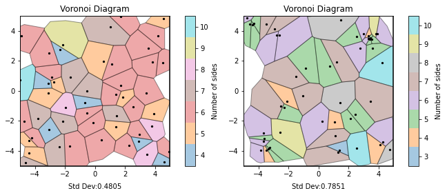
In the left hand diagram above, the points were randomly generated using a 2D random Poisson Process, whereas the points in the right hand diagram included some forced clustering. You can hopefully see that there is a significant degree more variation between the sizes of the shapes on the right compared to the shapes on the left. Regardless, included below each plot is the standard deviation of the normalised Voronoi areas, which numerically shows that there is significantly more variation in the areas on the right, and hence more clustering present.
This technique is easily expanded into the three dimensions needed for the null point data being analysed. Instead of flat polygons, the tesselation produces 3d polyhedra, and so the relevant measure is volume rather than area. In this case, a 3D random Poisson Process is used to determine the standard deviation of the Voronoi volumes when there is no clustering present, which is calculated to be approximately 0.42.
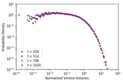
Since the simulation of a magnetohydrodynamic field being used contains data for 1024 time steps, I felt it necessary to check if there was any significant variations between different time steps. To do this, I calculated the Voronoi volumes for the data at time steps 256, 512, 768 and 1024 and plotted a combined probability density function of the four volume sets (shown below) as well as comparing the standard deviations. There was no significant variation noted, and so I continued the analysis focusing on a single time step in order to reduce needed computation time.
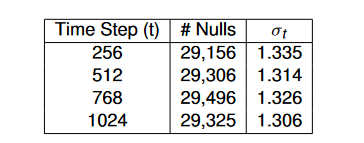
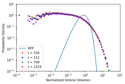
As can be read off the table above, the average standard deviation for the null point Voronoi volumes was approximately 1.320, slightly more than 3 times that of a random Poisson Process. From this, in the same vein as above with the 2D example, I concluded that there was a signicant degree of clustering occurring within the null points. In addition, I also produced a comparison of the probability density function Voronoi volumes from the data against the volumes from a random Poisson Process. This diagram, shown below, is very clear in showing that there is a stark difference between the simulation data and the uniform random data.
From this analysis, I concluded that there was definitely clustering occurring among the null points gleaned from the magnetohydrodynamic simulation data. This conclusion opens the way for further research on the occurrence of magnetic reconnection within these clusters, as well as an investigation on the time evolution of the location of these clusters within the field, as my work only showed that clusters occurred similarly throughout the simulation, not that they were static.
After submitting my thesis, I went on to investigate further methods of visualising the data from my research in a more compelling way. Through the use of several python packages, I was able to produce an interactive 3-dimensional display of these points, where the points are coloured from red to green depending on the number of other points that exist in a certain vicinity, with red meaning less neighbours and green meaning more neighbours. I have been able to recreate this display below using threejs for your interest.
The display can be rotated using left-click and drag, zoomed using the scroll wheel and panned using right-click and drag. In addition, it can be reset to its original position by pressing the R key.